← See all of Michael’s work
Website copy

Monotype website

With more than 20,000 fonts in its library, Monotype is one of the world’s largest providers of type-related products. They’re behind the text we read on the pages of newspapers and books, on the websites we browse, on the games we play and the goods we buy. Despite the ubiquity of their products, Monotype as a corporation had the image of a faceless global giant. At the invitation of SEA, I started working with the company in 2012, developing a tone of voice for type specimens and new products that made them sound more human, but still expert and authoritative. monotype.com went live in 2015, with text (and design) that helped to make the company easy to navigate and understand, and highlight its unrivalled track record of creativity and innovation. Design: SEA and iA

Science and technologyWebsite copy

About the project

"We are the company behind type. Our fonts and technologies bring the world’s words to the page and screen."

"Whatever you’re reading, there’s a good chance Monotype is behind it. From the digits on your alarm clock to your book at bedtime, from your car dashboard to the signs at the airport, from apps, games and websites to billboards, logos and packaging, we make fonts for everything, everywhere and everyone. We’ve been doing it for years, and we’re still meeting new design demands with every typeface we create."
Website copy

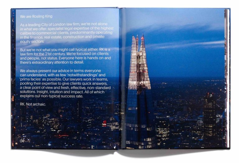
Rosling King corporate book and website

Rosling King is a leading firm of lawyers in the City of London. Their advice is high-level, for major clients in finance, real estate and construction, but their approach is refreshingly down-to-earth. My job in Browns’ rebranding of the practice was to express this unusually warm, easygoing nature and its part in the development of uncommonly effective solutions. rkllp.com Design: Browns

Business, finance and law
Brochure

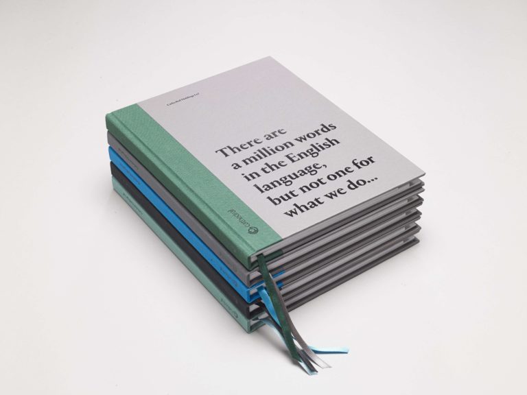
Cathedral annual review

Cathedral (now U+i) work with local people, local authorities and some of the UK’s most creative thinkers to transform overlooked scraps of the metropolis into thriving, accessible, mixed-use developments. I developed the concept for its 2014 annual review and then the text, making a virtue of Cathedral’s past frustration in describing itself and its activities. ‘Property developer’ was a misnomer and ‘agent of socio-economic change’ was a mouthful. The lack of an appropriate noun only underlined the newness and originality of the company’s approach. Inside, chapters were given headings such as ‘Call us contradictory’ and ‘Call us ambitious’. Writing to Cathedral CEO Richard Upton, Lord Herman Ouseley called the book ‘bold, brave and brilliant.’ So well-liked was it that the review gained a longer life, as Cathedral’s corporate brochure and manifesto.

Property and interiors
Website copy

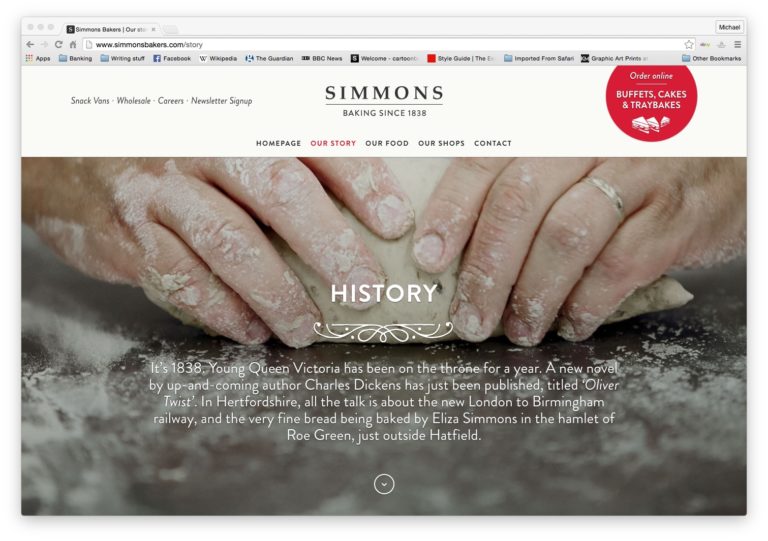
SImmons Bakers website

Simmons Bakers has been feeding Hertfordshire’s hungry with oven-fresh bread and cakes for 180 years. When the time came to bake a tempting new Simmons brand, I provided the verbal filling, with a tone of voice that was half high street, half artisan. Simmons Bakers Design: Taylor/Thomas

Work with Michael

Got a project like these?

Send an enquiry through ProCopywriters and Michael will reply to you directly.